

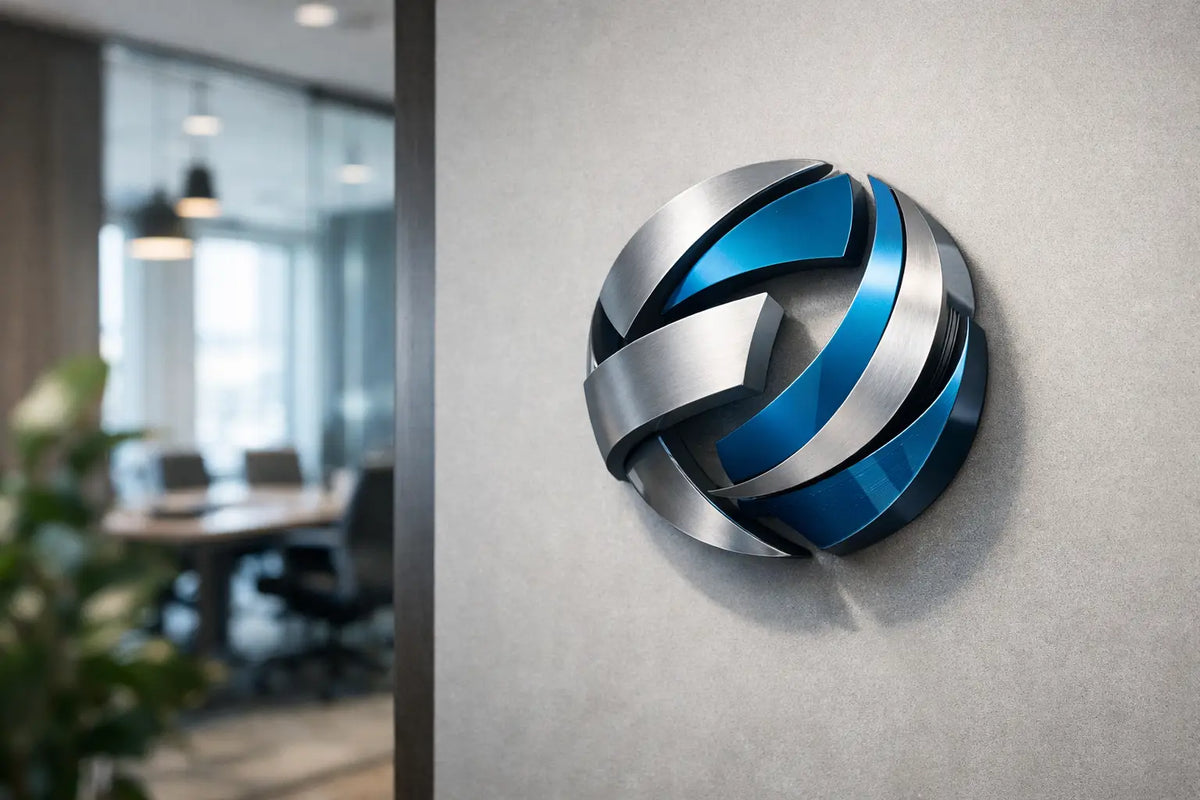
A logo on a website is just a few centimeters. A logo on a wall can determine whether a guest notices your café, a customer finds the reception without fumbling, or remembers your salon after a visit. The complete guide to 3D logos starts right here: not with color selection, but with the question of what the brand should achieve in a specific space. Welcome, navigate, sell, or leave an impression?
A 3D logo is not just a raised inscription. It's a physical signature of the brand that works with depth, light, shadow, and material. When executed correctly, it transforms a blank wall into a focal point that automatically draws eyes and cameras. However, for the effect not to appear cheap, design, size, production technology, and installation location must all work together.
What Makes a Logo a Truly 3D Element
A flat logo is printed or cut in one plane. With a 3D logo, the letters, symbol, or entire emblem are raised above the background. This creates visible depth and a natural shadow, which adds more weight to the identity. The effect can be subtle and elegant, or striking, spatial, and backlit.
The biggest advantage is its variability throughout the day. Daylight creates shadows and highlights the material's texture. In the evening, lighting takes over. A well-designed 3D logo therefore doesn't appear as mere decoration, but as an integral part of the interior or facade.
On the other hand, a more prominent form requires more precise decision-making. A too-small inscription with a complex font can lose legibility from a distance. Strong backlighting in a small, cozy space, conversely, can easily overpower the atmosphere. The goal is not to add as many effects as possible, but to give the brand exactly the attention it needs.
Where 3D Logos Work Best
In establishments, it usually has its strongest place behind the reception, behind the bar, at the entrance, or on the main visible wall. These are places where a visitor's gaze naturally pauses. In a hairdresser's or beauty studio, the logo can create a clean background for photos of work results. In a restaurant, it enhances the interior's character and helps distinguish the establishment from dozens of similar places nearby.
In an office or showroom, it plays a different role. It adds credibility during meetings and shows that the company has a firm grasp of its identity. For home use, a 3D inscription is suitable for a game room, studio, children's room, or as a personal luminous statement in the living room. The main difference is the level of representation: a company needs recognizability, while a home can be more playful and personal.
Before ordering, stand in the place from where the logo will be most often seen. Consider the distance, eye level, surrounding lights, and wall color. A logo that looks beautiful in a visualization may lose some of its impact on a textured concrete wall or against a large window.
Material Determines Mood and Durability
Material is not just a manufacturing detail. It determines whether the logo appears technological, luxurious, natural, or playful.
Acrylic for a Clean Modern Look
Acrylic is one of the most popular choices for interior 3D logos. It allows for precise cuts, a smooth surface, and a wide range of colors. The glossy variant reflects light and adds energy, while the matte is calmer and more elegant. Acrylic is suitable for receptions, shops, salons, and modern offices where the logo should appear precise and contemporary.
Another advantage is the possibility to combine colored layers. A light front element, darker sides, and subtle backlighting create depth without unnecessary visual clutter. For very fine lines or small text, however, it is necessary to verify whether the motif will still be legible at the final size.
Metal for a Premium Impression
Stainless steel, aluminum, or brushed metal give the brand solidity and timelessness. They are suitable for hotels, premium studios, offices, fitness centers, and representative facades. Metal can work with reflections from its surroundings, which is attractive but also more demanding in terms of lighting conditions. In a too-dark space, it can disappear, while in direct sunlight, it can glare intensely.
A metallic 3D logo doesn't have to be cold. When complemented with warm white backlighting or placed on a wooden base, a combination is created that looks professional yet pleasant.
Wood, PVC, and Combined Solutions
Wood brings texture and a human dimension. It naturally fits into cafes, creative studios, children's spaces, and interiors with an organic style. PVC is suitable where you are looking for a lighter and more affordable solution with a clean color result.
Combining materials offers the most room for originality. A wooden base with an acrylic emblem, a metal sign with an LED contour, or UV-printed graphics complemented by raised letters can create a unique visual signature. However, this only makes sense when the combination supports the brand identity. Complexity alone is not design.
Light Transforms a Logo into a Landmark
A 3D logo works even without illumination, but light gives it another layer. It's not just about being visible after dark. The right type of lighting affects the mood, legibility, and impression of the entire wall.
Front lighting creates a clear, directly legible effect. It is suitable for brands that want to be unmissable, for example, in a shop window or a busy commercial space. Backlighting creates a soft glow around the letters and highlights their silhouette. It often appears more premium because the light does not shine directly into the eyes but reflects off the background.
Side light can emphasize depth, especially for more pronounced relief letters. However, it is important to carefully consider the placement so that individual parts of the logo do not get lost in shadows. For outdoor installations, weather resistance, safe power supply, and legibility from a greater distance must also be considered.
The color of the light should align with the brand's character. Warm white creates a welcoming atmosphere and suits wood, gastronomy, or the beauty segment. Cooler white suits technological, minimalist, and cleanly designed spaces. Colored LED light can be very powerful, especially if it is already part of the brand colors. But if overdone, the logo will compete with the rest of the interior instead of unifying it.
Size and Legibility: The Most Common Source of Error
"We want a big logo" is a good start, not a manufacturing brief. The correct size results from the wall area, viewer distance, and the amount of detail in the graphic. A wide, simple emblem can occupy a large part of the wall and still appear airy. A long name with a delicate font will need a larger size than people expect.
Leave enough free space around the logo. An empty area is not wasted space, but a frame that makes the identity stand out. If the wall is full of shelves, plants, paintings, and other signs, even a precisely manufactured 3D logo will not have room to shine.
When designing, it is useful to work with a real photo of the interior and a scaled visualization. A free design and consultation will help reveal whether the logo will be too high, too small, or optically submerged in surrounding elements. This phase often saves the most money and subsequent adjustments.
How the Journey from Logo to Finished Realization Proceeds
The ideal basis is the logo in vector format, for example with curves, because it allows for precise production in any dimension. If you only have a PNG, JPG, or even a photograph of an old business card, the graphics can often be prepared again. For more complex motifs, it's good to first verify which details are worth preserving and which to simplify for a cleaner result.
Then comes the choice of material, dimensions, colors, the thickness of the plastic element, and the type of light. This is followed by a design, which should show not only the logo itself but also its relationship to the specific wall. Only after approval does production and installation solutions make sense.
Installation can be on spacers, an adhesive system, a template, or a structure depending on the weight of the material and the type of substrate. For a backlit logo, it is necessary to consider the power supply from the beginning and where the wiring or power source will be hidden. The most beautiful realizations look simple precisely because these technical aspects were resolved in advance.
Complete Guide to 3D Logos in Practice
When choosing, don't just ask yourself what the logo should look like. Ask what a person should take away when they pass by it. Should they feel like coming inside? Should they want to photograph the space? Should they feel like they are in the right place?
AtmoSvetla translates ideas into custom illuminated and 3D realizations so that the logo is not just a mark on the wall, but a part of the atmosphere and commercial impression. A two-year warranty, thoughtful design, and handmade processing are significant when the resulting element will function even after the initial excitement.
Send us your idea, a photo of the space, and your logo. Let us show you what it will look like in real scale. A good 3D logo doesn't start with production – it starts the moment you can imagine your brand shining brightly right there.