

Content note: This text was created with the support of artificial intelligence and has been editorially reviewed. We view it as a tool for faster inspiration, not as a substitute for real-world manufacturing and installation experience.
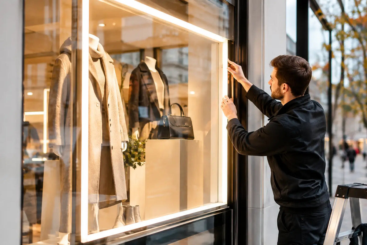
In the evening, someone who doesn’t know you yet walks past your establishment. They have a few seconds to understand what you offer, notice your name, and find a reason to walk inside. This is exactly where the production of a lighted storefront begins. It’s not just about light behind glass. It’s about the first impression that keeps working even when you’re closed.
A well-designed lighted storefront doesn't overwhelm. It directs the gaze to what matters most - the name, logo, main message, or product. It gives a restaurant the energy of evening life, a salon a clean premium character, and a shop a clear identity in a street full of visual noise. But for the result to avoid looking cheap or chaotic, design, material, technology, and the specific installation site must all be connected.
What a lighted storefront should actually accomplish
The storefront doesn't have to say everything. It has to say the right thing. If a passerby recognizes the brand in an instant and understands that you are a place for coffee, tattoos, streetwear, or beauty services, it is serving its purpose.
The most common mistake is trying to cram a logo, opening hours, a list of services, several slogans, and decorations into the window all at once. The result is usually a visual that lights up but doesn't communicate. A clear hierarchy is stronger: a dominant brand, one readable message, and perhaps a smaller addition to support the atmosphere.
Distance matters, too. A sign that looks great from one meter away for social media photos might not work from the opposite sidewalk. For a shop on a busy street, contrast, font size, and simple shapes play the leading role. In an arcade or shopping center, you can work more subtly because the customer is closer and has more time to perceive the display.
Storefront production begins with a design, not the material
Technology is chosen only when it is clear what the storefront should convey and what impression it should leave. The design should be based on the logo, brand colors, the layout of the display, and the direction from which people are coming. The daily reality is also important: reflections in the glass, strong sun, surrounding advertisements, or window divisions can affect readability more than the power of the lighting itself.
That is why it makes sense to start with a visualization. With custom production, an idea can be turned into a design before final dimensions and installation are addressed. A free design within 24 hours is not just a nice bonus. It helps reveal whether the logo needs wider spacing, whether the text will fit in the display, and if the selected color will truly stand out against the specific background.
LED neon for emotion and memorability
LED neon is ideal where the storefront should feel lively, creative, and a bit different from a classic sign. It can mimic handwriting, icon lines, and punchy short slogans. It often works great for bistros, bars, studios, beauty operations, showrooms, and brands that want to create a space suitable for customer photos.
Its strength is in the atmosphere. On the other hand, it is not suitable for long paragraphs, overly small characters, or complicated logos full of miniature details. Neons also need thoughtful placement so that their glow doesn't blend with the surroundings and lose its contour in the glass.
3D logo and letters for a strong brand
3D letters and logos give a brand a firmer, professional expression. They can be made of acrylic, dibond, or metal and work with light from the front, back, or a combination of both. Backlighting creates a soft glow around the letters, which adds depth and a clean premium effect.
This format is especially suitable for companies that need the storefront to appear credible both during the day and after dark. The advantage is the exact alignment with the corporate identity. A limitation can be a very intricate logo, where some minor details may need to be adjusted so that they remain easily producible and legible.
Lightbox when the brand must speak fully
A light box offers a surface for graphics, a logo, a photograph, a price list motif, or a bold product message. Thanks to UV printing, colors and fine details can be preserved that neon or individual letters alone could not convey. It works well for shops, pharmacies, receptions, sports studios, and everywhere visibility from a greater distance is required.
However, a lightbox requires discipline in graphics. Large areas tempt one to overfill them with information. The best box often carries one dominant visual idea, not an entire flyer transferred into light.
Materials determine the impression and durability
Material is not a detail to be chosen at the end. It determines the appearance, strength, mounting method, and how the storefront will look in a few years. Acrylic is suitable for clean, glossy surfaces, precise shapes, and modern color schemes. Dibond offers a stable base for signs and graphic applications. Metal, on the other hand, brings strength and a character that fits industrial, premium, or minimalist brands.
With lighted advertising, it is tempting to look for the lowest price, but cheap materials often show up as uneven edges, weak construction, or uninspiring results. Quality workmanship does not automatically mean the most expensive option. It means that every element makes sense for the given use - from the base and cabling to the way the joints are covered.
A custom-made piece has an advantage here. It is not a universal product pulled from a box, but a solution adapted to dimensions, graphics, and space. For a storefront meant to represent a brand every day, this precision is visible.
Color, intensity, and readability day and night
The color of light affects emotion faster than text. Warm shades can feel welcoming, energetic tones give an establishment pace, and clean white promotes a modern, precise impression. However, there is no single right choice. The color must fit the brand, the surroundings, and the storefront material.
A brightly colored neon can be the very element that stops the gaze for a cafe or studio. For a law firm or clinic, the same approach might seem inappropriate. It is similar with intensity. Light that is too weak will disappear, and light that is too sharp will be unpleasant and can distort the perception of graphic colors.
Contrast is important. Light lettering on a light interior will be lost; a dark motif in the shadow of a storefront may not work after dark. If there are many reflections in the space, it can help to change the position of the motif, add a backing plate, or choose a more distinct type of design. A storefront is not a catalog photograph - it must hold its own on a real street.
Installation is part of the result, not the last step
Even a well-made logo can lose its effect with improper placement. Before installation, it is necessary to resolve electrical circuits, the load-bearing capacity of the surface, cable routing, access to power, and whether the advertising element will be installed on glass, a wall, or a structure inside the window. A clean execution without visible compromises makes the difference between a professional presentation and a temporary fix.
For business premises, it is practical to treat installation as part of the order. AtmoSvetla provides installation throughout the Czech Republic, but specific installation possibilities should always be confirmed before paying for the order. Every facade, storefront, and electrical installation has its own conditions, and verifying them saves additional modifications and unnecessary waiting.
Also, consider service accessibility. Lighted advertising should be beautiful, but also reasonably accessible for inspections or future graphic changes. A quality solution accounts for real-world use, not just the moment of handover.
When to transform your storefront
A new lighted storefront makes sense when opening an establishment, rebranding, or when the current sign has ceased to correspond to the level of your services. Sometimes it is not necessary to change everything. It is enough to add a prominent LED logo, create a light box for the main message, or replace uninspiring graphics with an element that gives the storefront a clear focal point.
Send your idea, logo, or even just a photo of the space. A well-designed lighted storefront won't start shining only after dark - it starts working the moment your customer notices you for the first time.