

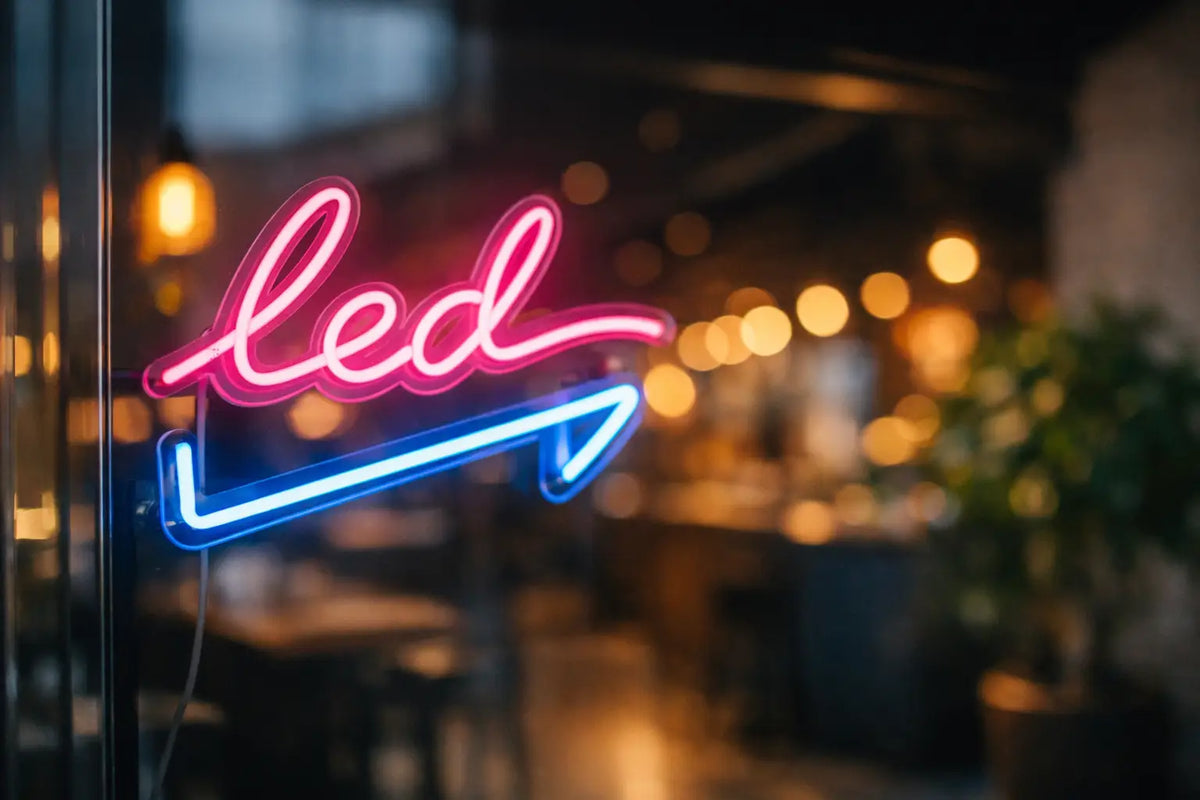
A shop window, reception, bar, or an empty wall in the living room – sometimes, just one well-designed lighting element is enough to make the entire space feel complete. This is precisely why LED neon signs are so powerful. Not only do they light up, but they also give the place character, create an atmosphere, and help people remember where they've been.
Classic neon had its charm, but current LED solutions offer greater design freedom, simpler operation, and more practical use both at home and in business. When chosen correctly, it doesn't look like cheap decoration. It looks like an intention. And that's precisely the difference that is visible in the result.
Why LED neon signs are so popular
The reason isn't just aesthetic. LED neon signs combine visual effect with functionality, a combination that makes sense for both apartment interiors and commercial spaces. In the home, they act as a distinctive accessory that creates mood without taking up space. In a business, they help attract attention, highlight a brand, or support a specific area, such as a bar, photo booth, or reception.
A big advantage is their versatility. You can have a short sign, a simple logo, a playful symbol, or a striking light statement across an entire wall. The color, size, font style, and mounting method can be adapted to the space. This is precisely why LED neons haven't just become a one-season trend, but a stable part of modern interiors and brand visual communication.
Where LED neon signs work best
The most interesting thing about them is that they don't look the same everywhere – and that's a good thing. In an apartment, they can be subtle, personal, and moody. In a business, conversely, they can be striking, contrasting, and commercially sharp. In both cases, however, the light must match what the space is meant to convey.
At home as a design accent
In interiors, shorter words, simple shapes, or motifs with personal meaning often work best. A bedroom can tolerate a softer, warmer tone, while a workspace might prefer cleaner, more energetic light. In a child's room, neon can serve as both decoration and night lighting; in the living room, it becomes a natural focal point.
It's not just about having something nice on the wall. A well-chosen sign helps create a mood that ordinary ceiling lights cannot. And it's this atmosphere that makes a space feel unique.
In a business as part of brand identity
Cafes, bistros, salons, showrooms, and offices all face the same question – how to look memorable. LED neon signs are practical in this regard because they can combine branding and decor into one functional whole. A logo behind the reception, a slogan on a photo wall, or a lighting element in a shop window have an immediate effect.
The greatest strength lies in the fact that customers can better associate such a space with a specific brand. If the sign is also photogenic, it works on social media too. People photograph the space themselves, and the visual spreads naturally. This is no small detail. This is advertising that doesn't look like advertising.
How to choose LED neon signs that will work
The most common mistake isn't in the color or the text. It's in making a selection based only on the impression from a picture. In reality, the context is paramount – where the sign will hang, from what distance it will be read, and exactly what it should evoke.
Size isn't just aesthetics
A small sign on a large wall will get lost. A piece that is too large in a small space, on the other hand, will feel restless. For corporate installations, it's also important from where the sign will be visible. A different size makes sense behind the counter, another in the shop window, and yet another for interior photography.
A good design takes into account the proportion of the wall, the ambient lighting, and whether the sign should be dominant or more complementary. It's worth not improvising here, because scale is what determines whether the result looks professional.
Color changes the energy of a space
Cooler white and blue shades look cleaner, more modern, and sharper. Warm tones like warm white, pink, or orange create a softer, cozier, and more emotional atmosphere. For brands, it's also necessary to ensure consistency with the visual identity. Neon can support a brand or completely destroy it if a color is chosen that is outside its character.
Sometimes the most striking solution is also the least suitable. If the sign is to be a long-term part of the space, it's better to consider whether the color won't become tiresome after a few months. Effective and usable are not always the same thing.
Font and shape determine readability
Handwritten scripts look stylish, but not every text remains easily readable in them. For longer words or more complex slogans, a simpler font is often better. For a logo, it depends on how its shapes are translated into a light line. Some details need to be adjusted so that the result works even when illuminated.
This is where the difference between an idea and its execution is evident. What looks great on screen may not be as powerful on a wall. A quality design therefore addresses not only the appearance but also how the lighting motif will perform in a real space.
Custom or pre-designed?
Both approaches make sense, but they serve slightly different purposes. Pre-designed options are quick, straightforward, and ideal when you want to complement an interior without complicated decision-making. They are suitable for homes, gifts, and smaller businesses looking for a proven visual motif.
Custom manufacturing, on the other hand, is the right choice when the light needs to convey a specific identity. A logo, business name, slogan, or completely original illustration requires a tailor-made solution. The advantage is clear – it creates a piece that will be unique and perfectly suited to the space and brand.
That's why it makes sense to collaborate with a partner who can translate an idea into a design without unnecessary complications. At AtmoSvetla, it's straightforward: send us your idea, get a free design, and the idea will become a real lighting element that has both aesthetic and commercial function.
What to consider before ordering
Before actual production, it's good to clarify a few practical matters. Not to make the process more complicated, but to ensure the result is right the first time. First, clarify the placement. An interior, shop window, reception, or home wall all have different demands for the strength of the effect and the type of attachment.
Then comes power supply and mounting. Sometimes, clean wall mounting is best, while other times a backplate or hanging solution makes more sense. It's also important to consider how the sign looks during the day. A quality LED neon should look good not only after dark but also during normal daytime operation.
For corporate installations, it's worth thinking about how long the motif is intended to function. If it's for long-term branding, it's better to stick with a timeless solution. If it's for a seasonal event, pop-up, or special event, the design can be bolder and more playful.
What distinguishes a successful LED neon from an average one
Almost anything can look good in a photo. In reality, however, details matter. The quality of workmanship, the precision of the bend, the cleanliness of the backing, the balance of light, and the overall composition. A successful LED neon doesn't look like an extra accessory. It looks like it belonged to the space from the beginning.
The service surrounding the product also plays a big role. When you have the option of consultation, free design, and a clearly defined process, the risk of ending up with something that lights up but doesn't work decreases. A two-year warranty then isn't just a formality, but a signal that the result is backed by certainty, not improvisation.
And this is where the difference between a cheap effect and a lighting solution with a real impact breaks down. Whether you want to make your apartment cozier, differentiate your brand, or create a place people will remember, LED neon signs give a space a voice. When that voice is well designed, it doesn't have to shout to be unmissable.