

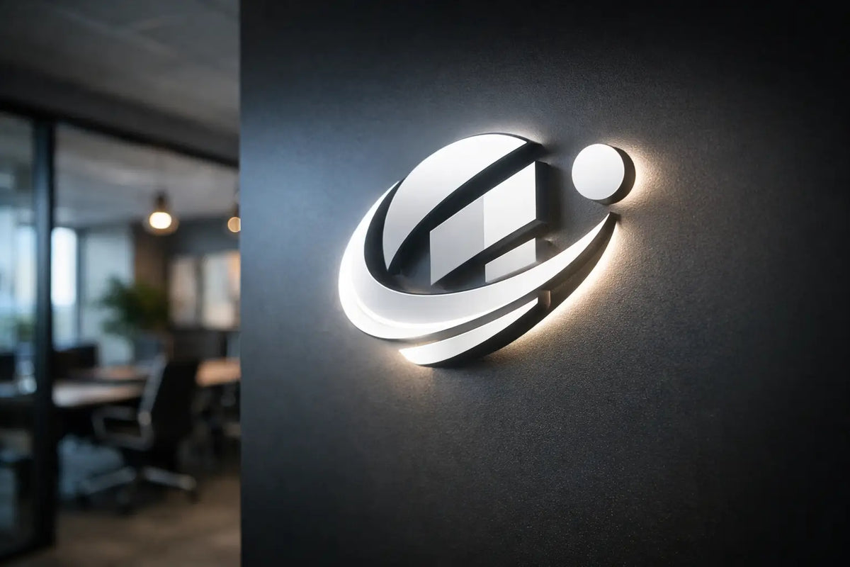
When a customer enters a space, they often make a decision within a few seconds. They notice the details, the lighting, the atmosphere, and whether the brand feels generic or has a clearly defined character. This is precisely where a backlit company logo makes a lot of sense - it’s not just a sign on the wall, but a visual focal point that commands attention and gives the space an identity.
For a restaurant, showroom, salon, reception, or office, this is one of the most effective ways to combine design with visibility. A well-designed backlit logo doesn't look like a technical accessory. It functions as part of the interior, reinforces brand recall, and often elevates the overall impression of a space more than costlier modifications that a visitor might not even consciously notice.
Why a backlit company logo has such a strong effect
A standard printed logo is flat. It may look good during the day, but at night or in a poorly lit space, it loses its energy. Backlighting adds another layer—depth, contrast, and atmosphere. Suddenly, the brand doesn't just look visible, but alive.
This is especially important in businesses where an experience is being sold just as much as a product. A cafe doesn't just want to mark the bar. It wants to create a place that people will photograph. A beauty salon doesn't just want to display its name. It wants to seem clean, premium, and simultaneously accessible. In a company reception area, it is all about the first impression, which should be professional, but not cold.
Furthermore, a backlit logo works well in photos and videos. In an era where interiors often live on through social media, reviews, and customer content, this is a practical advantage. When your brand shines correctly, the space feels more polished without being cluttered.
Where a backlit logo makes the most sense
It is most frequently used at receptions, behind bars, on main branding walls, or in zones where people pause. However, that does not mean it belongs only in representative spaces. A well-designed backlit company logo also works in smaller businesses where you need to get the maximum out of one powerful element.
In a restaurant, it can be a dominant feature at the entrance or a photogenic point in the interior. In a barbershop or beauty studio, it creates a premium impression even without complex equipment. In an office, it helps cultivate a meeting room, reception, or lounge area. And at a trade fair, it can make the difference between a stand that blends in and one that attracts looks from afar.
The lighting conditions matter, too. In a space with natural daylight, a logo will look different than in a darker interior or during evening operation. That is exactly why it is good to approach the design based on the actual location, not just based on the logo in the graphic manual.
What backlighting variants are worth considering
Not every backlit logo looks the same. There is a difference in the material, the thickness of the font, the distance from the wall, and the character of the light. Sometimes the goal is a sharp, modern expression. Other times, it is a soft aura that feels more elegant and less commercial.
A 3D logo with a halo effect is very popular, where the light does not shine directly forward but creates a glow behind the letters or symbol. The result is clean, luxurious, and highly legible. This type is suitable where you don’t want aggressive brightness, but rather a sophisticated light trail.
Another option is a combination of a 3D logo and front-lighting. This is usually more striking and suitable where the brand really needs to stand out. For some operations, a combination of UV printing, precision contour cutting, and backlighting is also ideal, as it allows for the preservation of graphic details while adding a light effect to the logo.
Choosing the light color is a topic in itself. Warm white feels cozier and works great in gastronomy or the beauty segment. A cooler shade is better suited for technological, minimalist, or more corporate spaces. Colored backlighting can be striking and memorable, but it isn't always a winner. When a color clashes with the interior or the brand identity, the result is distracting.
What determines whether a logo will feel premium
The first thing is proportion. The logo must neither be drowned out on a large wall nor so oversized that it looks cheap. The right size is based on viewing distance, ceiling height, and the significance of the area. What works behind a reception desk may not work in a narrow hallway.
The second thing is legibility. Some logos look great on a monitor, but when converted into a physical object, it turns out they have lines that are too thin, small gaps, or complex gradients. This is even more sensitive with backlighting. Light can highlight strengths, but also errors. That is why it is often worth slightly adjusting a logo for production without disrupting the brand identity.
The third factor is the background. A backlit logo on a rough concrete wall will look completely different than on a smooth laminate panel or dark paint. The wall affects not only the appearance but also the light diffusion. Sometimes the contrast between the material and the light aura creates the best effect. Other times, the surface needs to be prepared beforehand so the result doesn't look messy.
What to consider before production
The most common mistake is simple—the customer focuses only on the appearance and forgets about the placement, power supply, and mounting method. Yet these very details determine whether the installation will be smooth or unnecessarily complicated.
It is good to be clear about where the logo will be, from what distance it will be viewed, and at what time of day it is meant to function the most. One design makes sense for an operation open mostly in the evening, another for an office with all-day natural light. It is also decisive whether the logo should harmonize with the interior or, conversely, create a contrasting accent.
It is also practical to consider serviceability and long-term use. LED technology is efficient and reliable, but a backlit logo is still a physical element in a real-world environment. It must withstand regular use, cleaning, and potential removal during a relocation or redesign.
When a design is prepared correctly from the start, it saves both time and budget. That is the great advantage of custom solutions—the idea is not adapted to a finished product; rather, the product is built according to the space and the brand's goal.
A backlit company logo is not just for big companies
A common misconception is that a backlit logo belongs only in corporate receptions or expensive showrooms. In reality, it can have the greatest effect in smaller businesses where every detail shapes the perception of the brand.
A small cafe, a local boutique, or a new studio often don't have the budget for a large-scale interior concept. However, a single, strong, illuminated branding element can visually unify a space and give it a more professional expression. People then don't just take away an impression of the product or service, but also of an environment that feels well-thought-out.
Moreover, it's not just about aesthetics. If a logo attracts attention, it extends visual contact with the brand. That is a business benefit that is hard to measure at first glance, but in practice, it works. The customer remembers the space better, finds it easier to associate the name with the location, and is more likely to recommend you to others.
When to choose a subtle solution and when to go for a striking effect
This is exactly the moment where there is no single right answer. It depends on the brand, the interior, and the type of clientele. A luxury segment often benefits from a subtler halo backlighting that feels calm and confident. Young gastro concepts, gaming zones, or modern retail can afford a stronger glow, more contrasting colors, and bolder execution.
If the logo is meant to be the main focal point of the space, a more striking effect makes sense. If the interior already contains many visual elements, it is often better to work more sparingly. A good lighting solution doesn't have to scream. It just needs to sit exactly where it should.
This is precisely why free design and consultation regarding a specific space are so valuable. A visualization or mockup often reveals that the original idea was too weak or, conversely, unnecessarily excessive. AtmoSvetla constructs such installations so that the logo is not just beautiful on its own, but also functions in real-world operation and within the atmosphere of the given place.
A strong brand isn't just about what you say. It’s also about how you look when the customer hasn't heard anything yet. If you want your space to speak more clearly, light is one of the smartest ways to give it your own signature.