

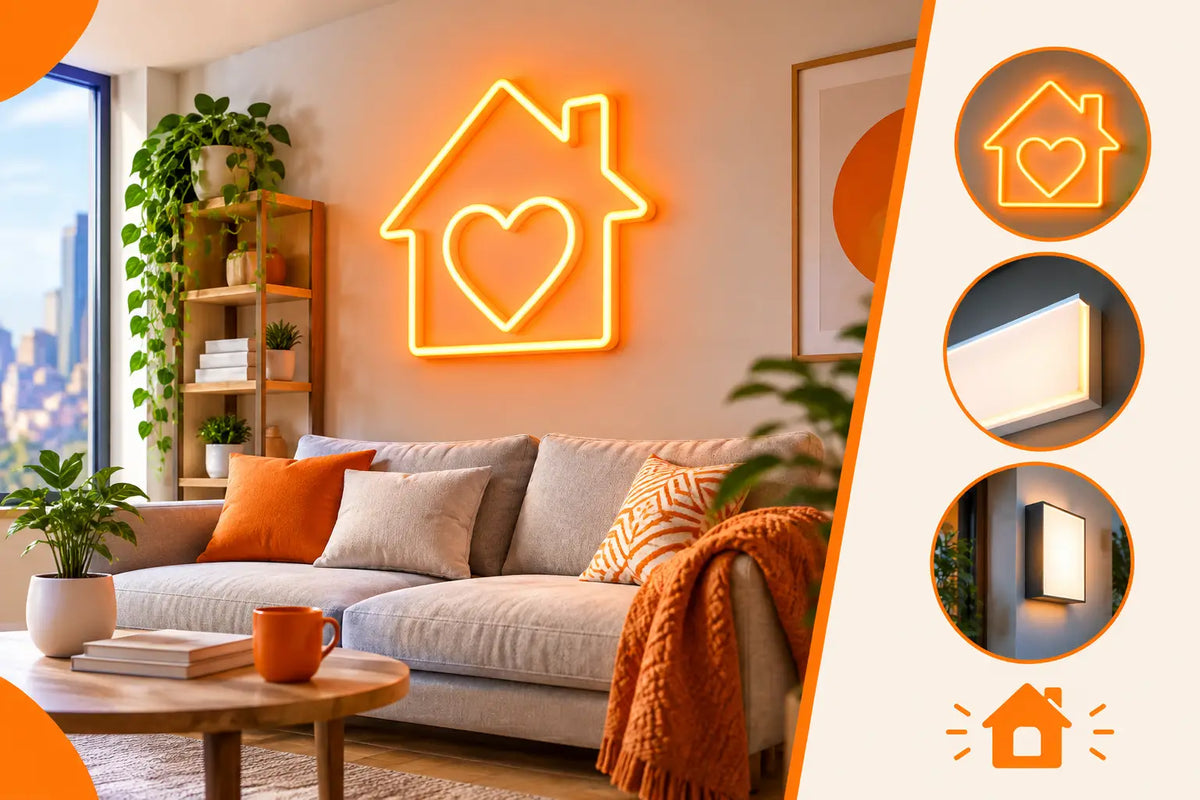
A neon sign at home is not just there to glow. It should catch the eye, support the mood of the room and say something about you before anyone starts a conversation. The question of where to place a neon sign at home is therefore not only about finding an empty wall. What matters is what the sign should highlight, where you will see it from most often, and whether it should be an intimate detail or the main visual moment of the whole interior.
The right spot turns your own slogan, a favourite word, a gaming nickname or a simple symbol into a personal signature. A poorly placed neon, on the other hand, loses its power even if its design is perfect. Before you choose the colour and text, look at the space through the eyes of a guest and through the lens of your phone.
Where to place a neon sign at home depending on what it should create
The best position is not automatically the middle of the largest wall. Sometimes a corner, an alcove or a section of wall that would otherwise have no character works best. LED neon is a design element that can visually tie furniture, pictures, shelves and personal items together into one scene.
Above the sofa or in the main relaxation zone
The wall behind the sofa is a natural candidate, because you see it when you enter the room and it also forms the backdrop for time with friends. A short phrase, an abstract line, a silhouette or a motif that is meant to be part of the evening atmosphere works well here. Hang the sign so that it is neither stuck too high up by the ceiling nor hidden behind the backrest. Ideally, it should visually follow the centre of the arrangement, not just fill an empty space.
If the wall is full of pictures, shelves or striking textures, choose a simpler motif. Neon needs calm around it. One strong element does more than several decorations competing side by side.
Above the bed as a personal message
Above the headboard, a neon sign feels very personal. It can carry a date, initials, a sentence that belongs only to the two of you, or a delicate symbol. Here it pays to choose a more modest size and a shade that does not feel harsh when you look straight at it in the evening.
The distance from the headboard and easy control are important. Give the sign enough breathing room so that it does not feel like yet another picture squeezed in above your head. If you have a low ceiling or a prominent headboard, horizontal text is usually a safer choice than a tall motif.
In a gaming corner or work setup
A gaming room, streaming corner or home studio is a natural environment for LED neon. Here it does not have to be subtle. On the contrary, it can form the background for videos, calls or photos and put your nickname, logo or motto right in the frame.
It works best on the wall behind the monitor, next to the desk or in the background of the camera angle. Before making a final decision, do a quick test with your phone. What looks good from the chair may not look good on video. Check that the motif does not clash with your head, the monitor or an open door, and that the power cable is not needlessly visible in the shot.
By the dining table or home bar
A home bar, dining corner or the place where friends gather can handle a sign with a sense of humour. A short quote, a cocktail icon, a heart or a personalised name for your home bar give the space a character that guests will remember. It is exactly the kind of detail that shows up in photos from the evening.
Here it is good to work with eye level when standing. The sign should not be hidden behind chairs or hung so high that it feels distant. If there is a glossy surface, glass or a mirror nearby, allow for reflections. They can multiply the effect, but they can also double the text and spoil its legibility.
In the entrance area as a first impression
The hallway or entrance area is often underestimated. Yet this is exactly where a simple neon symbol, a surname or a greeting can create a clear first impression. In a smaller space, avoid text that is too long. A short word or graphic motif is easier to read and lets the entrance breathe.
Placing it by the entrance has one more advantage: the sign does not belong to just one corner, but welcomes everyone who comes in. For families, couples and households that love having friends over, it is a personal detail with an immediate effect.
Sightlines first, then drilling
Before you mark points on the wall, walk around the room from several spots. Come in, sit where you spend the most time, and look from where you often take photos. A neon sign should have its own natural line of sight. If you place it outside the main axis, it can look like a randomly added accessory.
A simple trick helps: cut the outline of the sign out of paper at actual size and stick it to the wall with painter's tape. You will immediately see whether the motif needs to be a little higher, smaller or, on the contrary, bolder. With your own text, do not go by the number of letters alone. The shape of the words, the spacing between characters and the proportions of the whole composition matter too.
Also think about the distance from which the sign will be read. A short word can be delicate and smaller. A longer quote needs either a larger surface or shortening. If you try to fit too much text onto a small wall, the neon loses the lightness that people buy it for.
Colour is not just aesthetics, but the mood of the place
Warm tones such as pink, orange or warm white create a softer, more personal feel. Blue and purple add digital energy to the scene, which suits gaming, a music corner or a creative studio. Green can feel fresh and playful, but it will stand out more on a dark wall than on a light background.
Always relate the colour to the material and shade behind the sign. On a dark wall, most colours stand out more sharply. On light plaster, a soft shade can look elegant, but a motif that is too light will lose contrast. If you want the sign to be the focal point, choose contrast. If it should only complement the space, match it to the colours of your textiles, posters or personal style.
Do not forget that an LED neon has character even when it is switched off. The shape of the lettering and the backing are therefore just as important as the glow itself. Transparent acrylic looks light, while a coloured or printed backing can turn the sign into a standalone art piece.
Practical details that decide the result
The power supply is part of the design, not a nuisance to be dealt with after production. Choose a wall with a reasonably accessible socket and plan the cable route in advance. Sometimes the cable can be discreetly run along the edge of furniture; at other times it makes sense to hide it in a trunking strip painted the colour of the wall. A clean installation lets the design stand out instead of the technical background.
Another thing is the surface. A smooth, solid wall offers the most options. For tiles, slats, uneven plaster or a very textured surface, the mounting needs to be adapted to the specific situation. If you want the sign outside on a covered terrace, balcony or by the entrance, choose an outdoor version straight away. Indoor and outdoor use are not the same.
Also consider whether the sign should be a permanent feature of the interior or whether you may want to move it later. A personalised motif has great emotional value, but very specific text is harder to take to another space. A more universal symbol, initials or a short motto, on the other hand, can bring you joy even after you move house.
When you want a sign no one else has
A ready-made motif can be inspiring, but the greatest power lies in a neon that comes from your own story. It can be handwriting from a letter, the outline of a pet, your own logo, a line from a song or a symbol that only you understand. It is exactly this kind of detail that turns decoration into part of your home's identity.
At AtmoSvetla, we make LED neon signs by hand to order. Send us your idea, a photo of the space or just the text you want to light up. We will prepare a design and price quote free of charge within 24 hours with unlimited revisions, so you know before production how the sign will work on your wall.
The best place for a neon sign is not the emptiest one. It is the place that already carries your everyday life – meeting friends, playing, creating, resting or remembering. When you put the sign right there, it will not just glow. It will have something to say.