

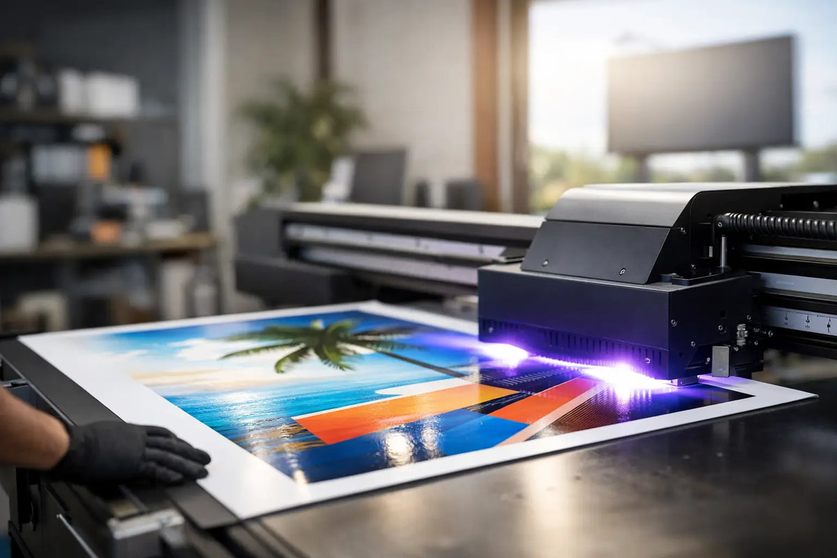
The sign at the entrance often makes a decision before the first word from the staff. It should be legible from the sidewalk, harmonize with the interior, and withstand normal operation, weather, and daily customer views. It is precisely UV printing on advertising signs that gives brands the opportunity to transfer full colors, delicate graphics, and a distinctive character onto rigid materials without compromising between aesthetics and function.
It's not just about getting a logo on a board. A well-designed sign sets the atmosphere of a place even before a visitor opens the door. It can appear clean and premium, playful and colorful, or technical and minimalist. The crucial thing is that it supports what your brand truly is.
What is UV printing and why does it work on signs?
In UV printing, the ink is cured by UV light practically immediately after application. The result is a sharp and stable print that adheres well to a variety of rigid materials. The technology handles vibrant color areas, small texts, photographic motifs, and gradients that might lose detail with other processing methods.
For an advertising sign, this is a powerful combination. You don't have to limit yourself to single-color lettering or a simple symbol. If your coffee shop has an illustrative logo, a beauty salon works with subtle shades, or a showroom needs to present a product photograph, UV printing can transfer the design with a precision that is visually apparent.
Another advantage is the ability to print with white ink. This plays a crucial role, for example, on clear acrylic, dark backgrounds, or for motifs that need to be truly vibrant. The white underprint creates a solid base for subsequent colors, so the graphic doesn't appear faded or get lost in the material.
UV printing on advertising signs isn't just for storefronts
Most people imagine a sign with a logo on the facade or next to the door. This is, of course, an important location, but the potential is much wider. Indoors, the print can mark the reception, a price list of services, navigation between rooms, or a photo wall where guests will gladly stop and take a picture.
In gastronomy, it functions as a stylish menu, order labeling, operating rules, or a backdrop behind the bar. In a salon, it can display the name of a service, a QR code leading to a reservation, or a striking brand visual. A store can use printed panels for orientation, promotional messages, and collection presentations.
An interesting effect arises when combined with LED lighting. A printed sign can form an independent visual element, while a luminous sign works next to it or directly in front of it. UV graphics add detail, texture, and information. An LED neon or 3D logo adds glow, depth, and attention-grabbing power. Such a combination has special power in the evening, in a storefront, and in photos for social media.
Material determines impression and lifespan
The same motif will look different on every surface. Therefore, don't start your selection with just size and price. First, clarify where the sign will be, how closely people will observe it, and whether the space should feel warm, industrial, or luxurious.
Acrylic for a clean and modern look
Acrylic sheets are popular for receptions, salons, offices, and modern establishments. Clear acrylic creates a light, almost floating impression, especially when mounted with standoffs. Milky acrylic softens the light and is suitable where you want a more subtle expression. Black or colored acrylic, on the other hand, allows for contrasting graphics and a striking logo.
With clear material, it's necessary to consider what will be behind the sign. White underprinting ensures readability but can limit transparency. If a transparent effect is to be part of the design, it must be planned during graphic creation.
Dibond for durability and a professional facade
Dibond is a sandwich material with aluminum layers, especially suitable for outdoor signs. It appears solid, flat, and representative. It is suitable for entrance signage, company boards, information systems, and larger advertising formats.
On a facade, it makes sense to consider direct sun, rain, mounting method, and the distance from which the sign will be legible. Extremely fine lines or small text may look great in a design on a monitor, but they won't work from across the street. For outdoor communication, a clear hierarchy wins: logo, main message, contact, or navigation.
PVC and lightweight boards for flexible use
Lightweight PVC is suitable for interiors, exhibitions, short-term events, or as affordable signage. It is easy to install and offers ample space for colors and detail. However, it is less premium than acrylic and may not be the first choice for long-term exposed outdoor use.
The right material therefore depends on the purpose. If you want an impressive element above the reception, acrylic might win. If you need durable signage for a business from the street, dibond often makes more sense. And if you're dealing with an event, promotional campaign, or temporary navigation, a lightweight board offers a practical solution.
How to prepare graphics so the sign truly sells
A sign should not be a miniature flyer. It has a few seconds for people to understand who it belongs to and what it offers. The best designs therefore work with plenty of free space. Letting the logo breathe is not a waste of space, but a way to give it power.
For text, contrast is crucial. Light lettering on a light background, a shiny motif in the reflections of a storefront, or too many shades of the same color can reduce readability. It's also worth checking the design at actual size. Font that is comfortably readable on a laptop may not stand up on a sign at eye level or on a facade.
Photos and illustrations should have sufficient resolution. A blurry file cannot be transformed into a sharp image by production. If you only have a logo in a small format or a poor-quality source, it is better to adjust the design than to push for quick production at any cost. A quality sign should elevate a brand, not betray improvisation.
A well-thought-out hierarchy also works well. The company name or logo is the first layer. The main service, for example, "specialty coffee," "barber studio," or "interior lighting," is the second. Phone, opening hours, and other information come after that. If all elements are equally large and loud, nothing will stick in the mind.
When to choose printing and when a luminous sign
UV printing is not a competitor to LED advertising. They are two tools with different roles. Printing excels where you need graphic detail, information, a colored area, or an accurate reproduction of a motif. A luminous sign, on the other hand, attracts attention from afar, works after dark, and creates an emotion that an ordinary sign cannot replace.
If the priority is navigation or the presentation of services during the day, a UV-printed sign may be completely sufficient. If you need people to find you in the evening among surrounding businesses, add light. For a strong brand effect, both solutions can be combined: a printed background, a dimensional logo, and an LED neon claim. The result does not appear cluttered if each element fulfills its own task.
Details that matter in production and installation
Before ordering, measure the space, including the area around it. A sign 80 centimeters wide may be inconspicuous on a large empty wall, while the same dimension in a narrow hallway will visually overwhelm the space. Also consider the installation height, the direction of visitors' gaze, and light sources that can create reflections.
The choice of mounting will affect the overall impression. Direct gluing is discreet but requires a suitable and clean surface. Standoffs add a three-dimensional effect and allow the material to stand out from the wall. For outdoor installations, it is necessary to choose a solution appropriate to the facade surface, the weight of the board, and wind loads.
Don't rush the final color approval either. The shade on the display may vary depending on monitor settings and ambient light. For brand colors, large areas, and premium realizations, a consultation before production makes sense. A free design is not just a pleasant bonus – it's an opportunity to adjust the size, contrast, material, and combination with light in good time.
A sign that works doesn't have to shout. It just needs to be precise, visible, and unmistakably yours. Send AtmoSvetla your idea, logo, or just an idea of the space's atmosphere – and turn a blank wall into a detail that people will see, remember, and associate with your brand.