

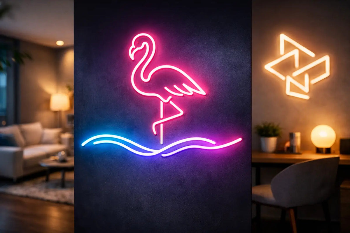
An empty wall in a business often causes more than just an aesthetic problem. It misses the chance to tell guests what your establishment is all about before they even order a coffee, browse the menu, or sit down in an armchair. A custom LED neon can turn this space into a clear brand signature, a photo spot, and a source of atmosphere. And at home? There, instead of a common decoration, it can feature your favorite motto, initials, or a motif that holds truly personal meaning.
The best light sign is not just "pretty." It has the right size, a readable shape, a color that works in a specific interior, and placement that naturally draws the eye. That is exactly why custom manufacturing makes sense. You don't start with what is in stock. You start with the space, the idea, and the goal that the light is meant to fulfill.
When a custom LED neon is the right choice
A ready-made neon motif can be a great, quick path to atmosphere. However, if you want to perfectly capture your brand, make a specific message visible, or coordinate the decor with the interior, a custom LED neon has much greater power. It is created for one specific location, not for an anonymous wall.
In a café, it can light up the name of the business behind the bar. In a beauty salon, it creates an elegant background for customer photos. In a fitness studio, it can boost the energy of the space with a short, memorable sentence. In a store, it can guide the gaze toward a new collection or the checkout counter. And in an apartment, it becomes a distinctive detail above the bed, in a study, a child’s room, or a home bar.
The difference lies in the intent. A logo on the wall strengthens brand memorability. A sign like “good vibes only” sets a mood. A light illustration can add humor, lightness, or character to a room. There is no universally best solution - it depends on whether you need to sell, navigate, build an identity, or simply make yourself happy.
Purpose first, then color and font
The most common mistake when designing a neon is starting with the question: “What pink do we want?” Color is crucial, but only once you know what the sign is supposed to do. Should it be seen from the other end of the room? Should it draw people to a photo spot? Or should it gently complete the atmosphere in the evening after the main lights are turned on?
For businesses, short texts, simple symbols, and logos adapted for a light format usually work well. A long sentence might look excellent on a screen, but it loses readability when scaled down. Neon is not a poster print. It needs enough space between the letter strokes and a shape that works even when viewed from an angle.
For home neon, you can be more personal. A name, date, quote, gaming handle, favorite drink motif, or pet silhouette—all of this can be converted into a light decoration. Even here, simplicity is often the most striking. One strong motif often has more effect than five small ideas next to each other.
Color is more than just decoration
Warm white feels clean, cozy, and timeless. It suits natural materials, minimalist interiors, and elegant salons. Cool white has a sharper, more modern expression and works well where the space is intended to feel technological or gallery-like.
Pink, blue, purple, and turquoise bring an instantly stronger emotion. They are photogenic and work great with an evening atmosphere, but they require a sensitive environment. On a wall full of other colors, they may get lost. On a dark background, however, they gain depth and shine more brightly.
If you don't know which path to take, it pays to base your decision on the brand colors, the materials in the interior, and the time when the sign will be lit most often. Daytime operations with large windows require a different approach than a bar or bedroom, where neon only stands out after dark.
How custom LED neon is created
Custom realization starts with an idea. It can be a finished logo, a sketch on paper, a photo for inspiration, or just a sentence you want to light up. It is important to include the dimensions of the space, planned placement, and the idea for the color. Thanks to this, the design can be adapted not only to the look but also to the actual scale.
A visual design and consultation follow. This is where it often becomes clear that it is better to simplify a logo detail, adjust font thickness, or split the text into two lines. This isn't a compromise on the idea. It is the path to ensuring the resulting neon looks clean and remains readable once lit.
The sign itself is created using modern LED technology, which offers a bright glow with low energy consumption. Compared to classic glass neons, it is more practical for everyday interiors and businesses: it doesn't heat up as much, is usually more durable, and allows for more precise work with shapes and colors. The result can be mounted on a transparent acrylic backing or designed to blend in with the wall as much as possible.
AtmoSvetla offers free design and consultation, so you don't need to have a completed technical drawing ready. Just send your idea. Together, we will refine a look that works both visually and practically, and the finished product comes with a two-year warranty.
Dimensions matter more than you think
A neon that is too small on a large wall looks lost. One that is too big can overwhelm the furniture, the logo, and the entire interior. Before choosing the dimensions, measure the area where the sign is to go and leave some empty space around it. Light needs room to stand out.
Above a bar or reception, a neon can take up a significant part of the width because it becomes the main focal point. Above a sofa or bed, a proportion that follows the width of the furniture without unnecessarily exceeding it usually works better. For a logo, the distance from which people will watch it most often is also critical.
Also think about the installation height. A sign meant for photos should be naturally visible in the frame, not just right below the ceiling. In a business, it must not collide with shelves, decorations, door openings, or the daily movement of staff. A good position is not one where there happens to be an empty piece of wall. It is one where the sign gets the attention it deserves.
Light that works for the brand, too
A custom neon can evoke emotion in an interior, but for a company, it can do much more. It helps create a recognizable place. People might not remember the exact shade of the chairs or the type of flooring, but they will remember the glowing sign where they took a photo. That is a detail that can appear in stories, reviews, and memories of a visit.
For this effect to work, the sign shouldn't just be a thoughtless copy of a logo. Sometimes it is better to use a simplified symbol, other times a short slogan or expression that naturally invites a photo. A brand doesn't have to scream. It just needs its own light moment.
For exteriors and shop windows, you need to think more about ambient light, viewing distance, and operating conditions. In an interior, atmosphere, reflections, and coordination with other lighting play a bigger role. Neon is not meant to replace the main light fixture. It should be an accent that gives the space its own energy.
What to send in your inquiry so the design fits the first time
The more specific the materials you provide, the faster the idea will turn into light. It is ideal to attach a logo or text, a photo of the wall, the approximate dimensions of the area, and information on whether you want the sign for an apartment, a business, a window, or an event. A few words about the style of the space—industrial, delicate, colorful, luxurious, or playful—will also help.
You don't need to know the exact dimensions or technical names of materials. That’s what the consultation is for. It is important to know what feeling the neon should evoke and who will see it. From that, a design can be built that will not just shine, but will truly work.
Light has the greatest power when it is not accidental. Send your idea, show the space where it should go, and let it turn into a distinctive point that will speak for you even after dark.
💡 Do you want to design your LED neon yourself?
Try the online LED neon configurator — select the text, color, and size, and you will see the price immediately.