

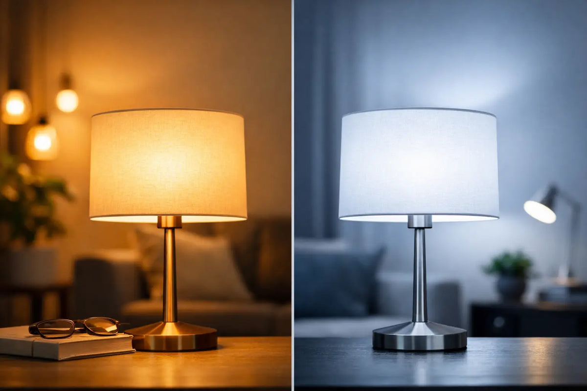
A kitchen can look expensive, a café stylish, and a bedroom cozy—but if you choose the wrong light color, the entire effect falls apart in a second. That is precisely why the question of warm versus cool lighting is not a detail for perfectionists, but a fundamental decision that changes the atmosphere, comfort, and how the space feels at first glance.
Light color doesn't just work with visibility. It works with mood, energy, and, in commercial spaces, with whether people stay, shop, or remember the place. A well-chosen light highlights materials, colors, and the character of an interior. A poorly chosen light can make even a beautiful space look flat, harsh, or impersonal.
Warm or cool lighting based on what you expect from the space
If you want a simple rule, start with this question: should the space calm you down or activate you? Warm light feels softer, more pleasant, and more homey. Cool light is sharper, cleaner, and supports the perception of detail and focus.
Warm lighting typically ranges between 2700 and 3000 K. It has a subtle yellow to golden tone that suits wood, textiles, and decorations. That is why it is so often used in living rooms, bedrooms, restaurants, or zones where a person is meant to slow down.
Cool lighting is usually from about 5000 K upwards. It appears whiter to slightly bluish, which is exactly what creates a sense of cleanliness, precision, and performance. This is the reason it appears in offices, studies, bathrooms, utility rooms, or places where you need to see every detail clearly.
Between them is neutral white, roughly 4000 K, which is a practical compromise for many spaces. It feels neither too cozy nor too cold. In many interiors, it is a safe choice, though not always the most impressive one.
Where warm lighting belongs
Warm light works where a space is meant to feel pleasant and human. In a home, this is typically the living room, bedroom, dining room, or reading nook. It is not just about aesthetics. Warm tones are more natural for the eyes in the evening and are less disruptive to rest.
They also perform a great service in hospitality and retail. A café with warmer light feels cozier, a boutique more elegant, and a reception more welcoming. When you want a customer not to perceive a space as sterile, but as a place with character, a warm light color is often a strong move.
It also looks good for decorative lighting, LED neons, and designer light elements. Warm light can highlight shape, add depth, and soften the overall expression. If the goal is atmosphere, not just simple illumination, a warm tone often has the upper hand.
However, that doesn't mean it is always correct. In a small room with dark furniture and a lack of daylight, overly warm lighting can feel heavy. And in a space where precision is required, it can unnecessarily dampen contrast.
When cool lighting makes sense
Cool light has a reputation for being unwelcoming, but that is only half the truth. If you use it in the right context, it works great. It supports alertness, improves orientation in detail, and optically cleans up a space.
That is why it is suitable for kitchen work zones, home offices, bathrooms by the mirror, or commercial operations where precision is key. In a salon, studio, or showroom, cooler light can help products stand out more sharply and appear more modern.
It is also excellent for light elements meant to look striking, futuristic, or maximally contrasting. For some brands and interiors, this visual sharpness is exactly what they need. Not every space is meant to be soft and warm.
The disadvantage is clear. If you overdo it with cool white, the interior can feel impersonal, even like an office. In the home, this is a common mistake, especially in living areas, where the light then creates a feeling of a shop window or a waiting room rather than an atmosphere.
The most common mistake: one light color for the whole space
People often approach the issue of warm or cool lighting as if they had to choose a single correct variant for an entire apartment or business. Yet, a quality lighting concept is not created by one number on a box. It is created by layering.
The main ceiling fixture needs one color of light, the lamp by the sofa another, and the light above the worktop another still. Likewise, in a business, the lighting for the bar works differently than the back office or the light branding on the wall. When everything is the same, the space loses its rhythm and function.
Practically, this means you can have warmer ambient light for the mood and, alongside it, a more neutral or cooler accent where you need performance. The result is an interior that not only looks good but also serves its purpose well.
How to choose the right light color at home
At home, it is best to start based on the time of day and the activity. If you are relaxing in a room in the evening, warm light will almost always be more pleasant. If you are cooking, applying makeup, working, or cleaning there, it makes sense to add more neutral to cooler light.
In the living room, a combination usually works best. The central fixture can be warm white, complemented by floor or table lamps that create depth and an evening atmosphere. In the kitchen, it depends on the layout. There is often beautiful warm light above the dining table, but above the work counter, a neutral or cooler tone is more practical.
In the bedroom, it pays to keep the light in warmer values. It helps to calm the space and visually softens materials and colors. Conversely, the bathroom is often a place where greater precision makes sense. By the mirror, you will appreciate light that does not distort and does not appear too yellow.
Warm or cool lighting in business
In a commercial space, the choice is even more sensitive because light influences not just comfort, but the impression of the brand. Warm lighting can humanize a business, extend stay times, and create the feeling that the space is thoughtful. This is powerful for cafés, restaurants, lobbies, or premium services.
Cool or neutral light helps where you need a clean, modern, and professional look. Typical examples are salons, showrooms, receptions, studios, or shops with a minimalist aesthetic. It also works well where the presentation of detail, texture, or product colors is important.
A strong effect is created by the combination of functional lighting and a light statement element. This is where it makes sense to think not only technically but also visually. A neon sign, a backlit logo, or a designer accent light can be the exact detail that makes a space stand out and sticks in people's minds. When the light color is aligned with the brand's character, the result doesn't feel like an extra decoration, but like a part of the identity.
Kelvin isn't enough. Materials and interior colors are also important
Two identical bulbs can look completely different in different rooms. A lot depends on what the light hits. Wood, beige walls, concrete, glossy surfaces, and colorful decorations all react to light differently.
Warm light highlights natural materials and gives them depth. Cool light, on the other hand, emphasizes white, gray, metal, or glass. Therefore, sometimes it is not about what is objectively better, but what fits the specific aesthetics of the space better.
If you are building an interior on softness, comfort, and layering of textures, overly cool light can break your whole intention. But if you want a modern, clean, and striking space, excessively warm light can look old-fashioned. This is exactly where the difference lies between an ordinarily lit space and a space that has style.
When you want certainty, think in zones
The most practical way is not to choose one universal answer, but to divide the space according to functions. A relaxation zone can handle softer and warmer light. A work or presentation zone will call for a cleaner and more precise tone. The transitions between them then feel more natural than one light for everything.
This is exactly how an atmosphere that makes sense is created. Not by chance, but intentionally. Whether you are dealing with an apartment, a café, a showroom, or a custom light element, the right light color is not the last detail on the list. It is one of the things that will decide whether the space just shines or truly glows.
So, the next time you ask yourself the question of warm versus cool lighting, don't look for one single right answer. Look for the light that will support exactly the feeling, impression, and effect you want to evoke in the space.