

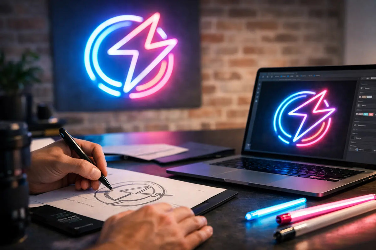
A logo on a monitor can handle almost anything. A logo in light, not so much. That is precisely why it is good to know how to design a neon logo so that it doesn’t lose the brand's character, remains readable at a glance, and at the same time truly functions within a space. Neon is not just an eye-catching accessory. It is a visual draw that can enhance the atmosphere of an interior, the memorability of a business, and the overall impression of your brand.
The most common mistake is simple: taking a standard logo and sending it to production without any adjustments. Just because something looks good in digital format or on a business card doesn’t mean it will work as a light-up sign on a wall. A neon logo has its own rules. When you respect them, the result will look clean, confident, and professional.
How to design a neon logo from the right foundation
First, clarify what the logo is supposed to do in the light. Is it meant to stop passersby at a shop window, create a photogenic focal point in a café, or add character to a reception, showroom, or home interior? The purpose is more important than it seems. Designing a logo intended to be seen from the street is different from designing a decorative sign for a living room or studio.
If the goal is branding for a business, you have to think in broader strokes. A person walks by, sees the light for a few seconds, and moves on. In such moments, simplicity, a strong shape, and clear contrast win. If it’s for an interior, you can afford finer detail, a more moody color, or more playfulness.
A good start is to answer three questions: what should be seen first, from where will the logo be viewed most often, and what emotion should it evoke? Luxury, playfulness, energy, calm, or a night-time vibe? Neon works with light as a mood, not just as an outline.
Logo shape matters more than detail
A neon logo stands on its silhouette. That is the fundamental difference compared to a classic graphic logo, where small details, thin lines, or subtle gradients often work well. In luminous form, clean lines, legible contours, and sufficient space between individual elements work best.
A complex symbol with many small details is usually a problem. While production is very flexible today, not everything that is technically possible is visually good. When a logo is overcrowded, the light bleeds together and the character is lost. Consequently, it looks less premium than you would want.
For symbols and icons, a simple rule applies: the more prominent the outline, the stronger the effect. For text logos, the font is key. Very thin or overly ornate fonts are usually a weaker choice for neon processing. Shapes that have rhythm, are legible from a greater distance, and do not appear jittery are better.
That doesn't mean neon has to be boring. On the contrary. Handwritten signs work well if they have a smooth stroke and aren't overcrowded. However, with script fonts, you need to ensure that individual curves and connections don’t bleed together in the light.
When to adjust the original logo
Often, it makes sense to create a simplified version of the logo for neon. This is not a concession to the brand; it is a smart adaptation to the medium. You can preserve the main shape, typography, and color scheme, but remove small elements, shorten a claim, or omit fine lines that would be lost in the light.
Especially with company logos, it is often better to work with the icon or the name without additional text. A slogan, address, or long subtitle is better suited for other media. A neon sign should be quickly legible and memorable.
Color is not a decoration. It is a message
The color of a neon logo affects not only the look but also how the space feels. Warm white is clean, elegant, and versatile. Cooler tones appear more modern and high-tech. Pink, blue, or purple can create a strong atmosphere, but they don't automatically suit every brand.
If you are designing a logo for a business, stick to the brand's visual identity and the environment in which it will shine. In a beauty salon, a softer, aesthetic tone may work. In a barber shop or bistro, a more contrasting and bold solution might be better. At home, it depends more on whether the neon is meant to dominate or just complement the interior.
It is good to also consider the color of the wall and ambient light. A white neon on a white wall can be very elegant, but it might not have as strong an effect as it would on a darker background. Conversely, a vibrant color in a small space can feel too aggressive after a while. Here, it is truly true that less is more.
Size and placement determine the final impression
Designers often focus primarily on the look of the logo, but where and at what size it is placed is just as important. A small logo on a large, empty wall can disappear. A logo that is too large for a narrow space feels cramped and loses its elegance.
Ideally, base your decision on the real viewing distance. If the logo will be seen mostly from a few meters away, it must have an appropriate size and sufficiently bold strokes. If it is meant to serve as a detail behind a bar, a reception, or above a desk, it can be more subtle.
Placement also influences how the neon is perceived in photos. And that is crucial for many businesses today. A well-designed neon logo often becomes a spot where guests or customers create content for social media. That is an aesthetic bonus and a marketing effect in one.
Background and construction are not secondary details
A neon logo does not exist in a vacuum. The final look will be affected by the surface to which it is attached. A clear acrylic backing looks clean and allows the light itself to stand out. A colored or shaped background can add more visual impact, but it can easily slide into clutter if it is poorly matched with the interior.
For brands that want a more premium or three-dimensional effect, a combination of neon with UV printing or 3D elements may make sense. This is ideal when you want to retain the detail of the logo while achieving a luminous wow effect. Sometimes, pure neon isn't the best choice. Sometimes, a smart combination of techniques works best.
How to design a neon logo that can be produced without compromise
Here comes the part that many people underestimate. A good design must be not only beautiful but also technically sound. Every curve, gap, and connection affects how the final sign will look and how reliably it will function.
That is why it is wise to consult during the design phase. In practice, it often turns out that a minor font adjustment, increased spacing, or a change in proportions makes the logo look significantly better. Such an adjustment is not a waste of time; it is the difference between an idea and a truly good result.
The advantage of custom manufacturing is that you don't have to deal with the design blindly. When the manufacturer understands both design and the technical side, they can point out weak spots before production. This is exactly where it makes sense to work with a partner who doesn't just deal with light, but also with how the logo functions in a space and for the brand. AtmoSvetla, for instance, is built on this very connection of aesthetics, readability, and real-world usability.
Most common mistakes that ruin the effect
The first mistake is usually too much information: name, slogan, icon, frame, additional text. It rarely works well in light. The second mistake is choosing the wrong font, which looks beautiful on a screen but loses readability in a physical space.
The third problem is underestimating the context. A neon sign may look great on its own, but once installed, it may clash with ambient lighting, decorations, or the wall texture. And the fourth mistake is purely psychological: trying to have the most striking effect at any cost. Just because it’s the most striking doesn't mean it’s the best. A good neon logo should attract attention, not visually scream.
When you want neon to both sell and decorate
A strong neon logo is not just a light-up version of your sign. It is a part of the space's atmosphere and, at the same time, a tool that helps the brand be seen. In a café, it can reinforce the identity of the place. In a salon, it creates a more premium backdrop. At home, it can become a personal statement piece that gives the space character.
The best designs are usually not the most complex. They are the ones that know exactly what they want to communicate. When you clarify the purpose in advance, choose the right shape, think through the color, size, and placement, and let the design pass through production logic, you will get a result that will shine for a long time—visually and commercially.
If you are currently thinking about your own neon, don't start with the question of what will be the most eye-catching. Start with what is meant to be seen, felt, and remembered. That is exactly where a logo that truly lights up a space begins.
💡 Do you want to design your LED neon yourself?
Try our online LED neon configurator — choose text, color, and size, and see the price immediately.