

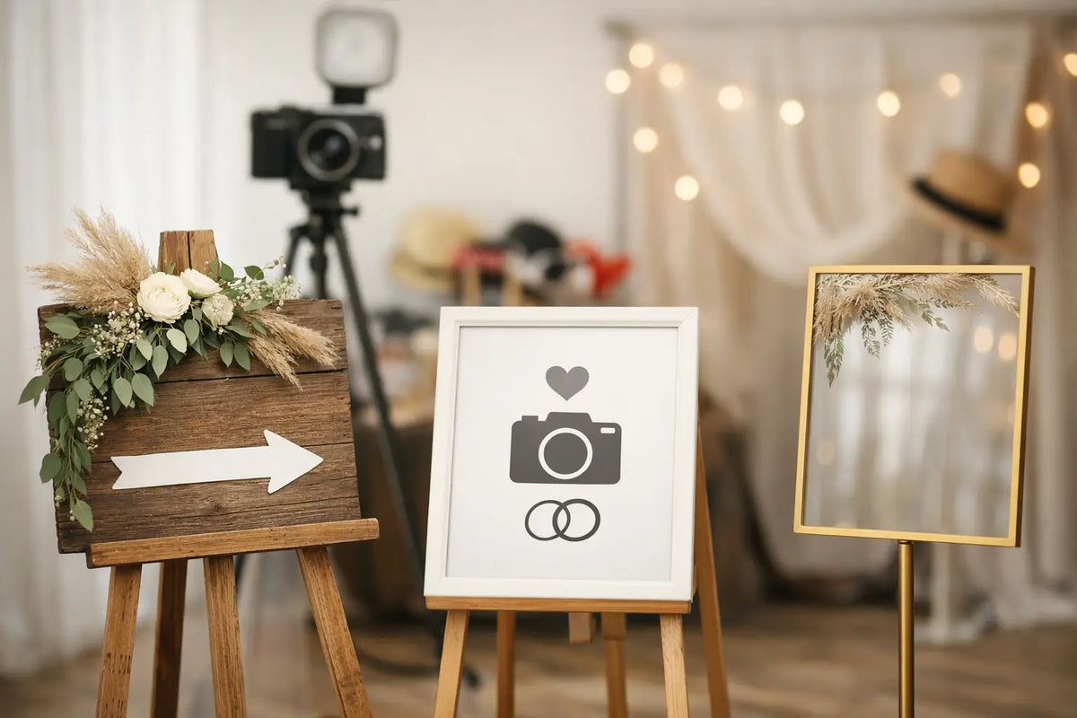
A photo booth is a place where evenings turn into memories – and a well-prepared event turns into content that lives on social media. The best sign for a photo booth is therefore not just a decoration above the background. It must work at first glance, in the phone's lens, and even when a group of guests in motion poses in front of it.
Whether you're planning a wedding, a bistro opening, a corporate party, or your own photo studio, the sign determines whether the resulting photo will look thoughtful or just like a snapshot in front of a blank wall. A correctly chosen neon sign will give the space identity, support the mood, and give guests a natural reason to stop, take a picture, and share it.
First, clarify what the sign should convey in the photo
The best solution doesn't come from picking the first pretty sentence from the internet. Start with the role the photo booth is supposed to play at the event. At a wedding, the sign can be a personal detail with the newlyweds' surname, date, or a short motto. In a cafe or salon, it should reinforce the brand and make the interior a place visitors associate specifically with you.
For a private celebration, emotion and lightness work well. Text like "Let's party", "Better together" or a simple heart symbol will set the mood for guests without explanation. For a corporate event, it makes sense to work with a logo, product name, slogan or hashtag theme. Just be careful: a photo booth is not a billboard. If guests have to read for too long, the message in the shot will be lost.
Ask yourself one practical question: can a person recognize the main motif within two seconds? If so, you're on the right track. A photo can handle a strong gesture, but not an overcrowded composition.
LED neon is often the best choice for a photo booth
A classic printed sign can be budget-friendly and makes sense for a one-off event. However, in evening light, it often blends in with the background and doesn't add energy to the scene in photos. An LED neon sign, on the other hand, works even after dark. It creates a glow that attracts attention, frames the face, and gives the shot a recognizable atmosphere.
Moreover, LED neon is not the same as old glass neon. It is lighter, safer for everyday use, and allows for custom lettering, logos, and simple illustrations. It is therefore suitable for rented event spaces, home corners, and businesses where the sign is intended to remain long-term.
However, this does not mean that a light sign will solve everything on its own. Too bright white light can create overexposure on some phones, especially when guests are taking close-up shots. A very subtle sign, on the other hand, can get lost in front of a colourful floral wall. The ideal is to balance the brightness, shade, and contrast with the background. For a sign intended for regular photography, a dimmer is also useful, allowing you to adjust the intensity to daylight and evening mood.
When to choose a different solution
An acrylic sign with UV print is excellent where you want to preserve subtle colours, illustrations, or detailed graphics. It looks clean, elegant, and works well, for example, at a daytime wedding, in a welcome zone, or as an addition to the main lighting element. A wooden sign adds warmth to rustic or natural decor but needs appropriate external lighting.
For a prominent branded photo booth, a 3D logo can also be a strong solution. It looks dimensional, representative, and carries more authority in a company's reception area or showroom than a standard poster. It therefore depends on whether you are building an immediate party atmosphere or a long-term visual identity for the space.
Text that guests will actually see
The length of the text matters more than it seems. Short inscriptions are easier to read, look stronger, and fit into the frame more easily. Two to four words are usually ideal. For names or hashtags, longer text can be used, but only if it has sufficient size and a simple font shape.
A script font can be romantic and elegant, especially for a wedding or beauty studio. For a restaurant logo, sports event, or tech company, a clean, more legible font usually works better. A distinctive font doesn't have to mean a complicated font. In a photograph that a person views in a second, a clear shape wins.
Choose the color according to the background, not just your favorite shade. Warm white looks subtle and timeless, pink adds playfulness, red energy, and blue or purple creates a more evening club atmosphere. If the wall is dark, light neon will get beautiful contrast. On a light wall, a colored sign may work, or a darker background made of acrylic, flowers, or fabric.
Sign size determines the quality of the entire composition
A small sign on a large wall doesn't look minimalist – it often just gets lost. Conversely, a sign that's too wide can obscure guests' faces or force the photographer to step so far back that details of the decor are lost. When planning, consider the number of people who are expected to fit into the shot at once.
For a couple or an individual, a more compact sign placed above the head is sufficient. If five to eight people are to pose in front of the wall, you need a wider background and a sign that won't get lost in it. The sign is most often strongest in the center of the upper third of the photo wall. Guests below it remain clearly visible, and the text gets into the photo without dominating every shot.
Don't forget the distance from the wall. Light projected directly onto a glossy background can create reflections. Matte fabric, artificial flowers, slats, or a subtly structured wall will beautifully support the lighting motif. In a small space, a simple background and one quality sign can be more effective than ten competing decorations.
Light must flatter people, not just the sign
A common mistake in photo booths is simple: the sign is beautifully lit, but the people in front of it are dark. The sign should be a visual magnet, not the only light source. Add soft frontal light, for example from the side or slightly from the front, to keep faces natural even when taking photos with a mobile phone.
Avoid strong light pointing directly from above. It creates shadows under the eyes, and the resulting pictures then don't look as good as they could. For outdoor events, consider the transition between daylight and evening. What looks decent at four in the afternoon can disappear after dark. A dimmable sign or separate auxiliary light will give you the necessary control.