

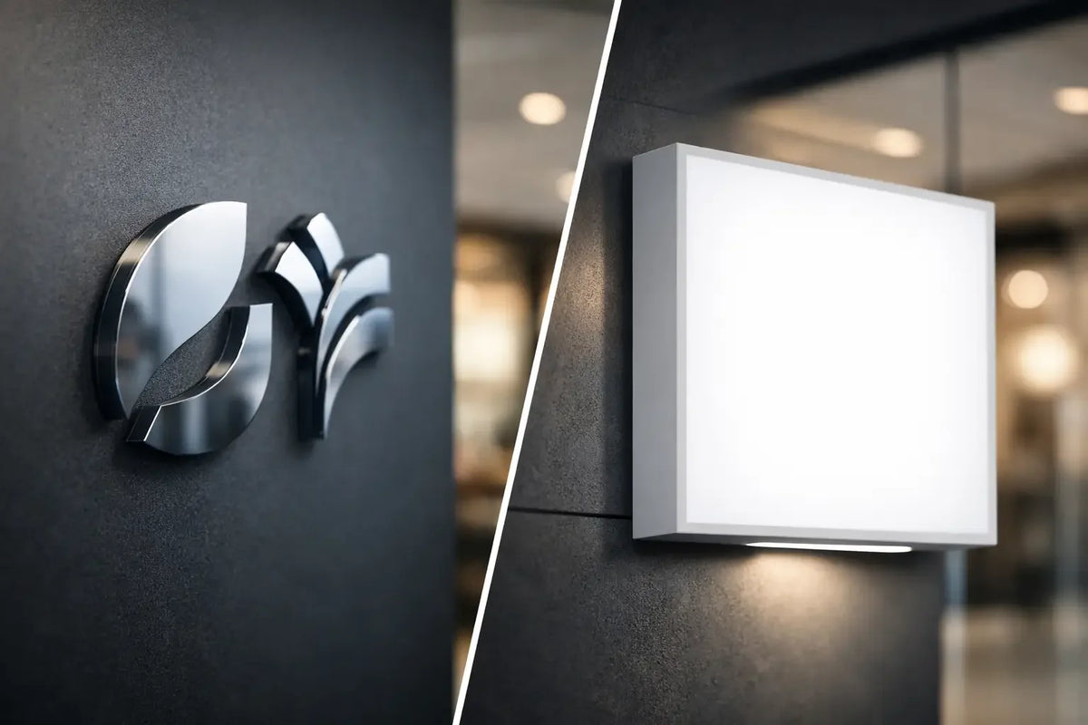
A shop window, reception desk, or wall behind a bar only have a few seconds to make a first impression. That's why the decision between an acrylic logo versus a light box is not just a technical question. You're choosing whether your brand should act as a precise part of the interior or as a prominent landmark that is visible from afar and works even after dark.
Both options can transform a space. However, they differ in character, placement requirements, light intensity, and what a visitor sees first. An acrylic logo works with detail and a three-dimensional effect. A light box relies on a clear surface, contrast, and maximum legibility. The right choice doesn't come from what is generally better, but from the location, purpose, and identity of your brand.
Acrylic Logo versus Light Box in Real Space
An acrylic logo consists of individual three-dimensional elements – letters, symbols, or an entire motif cut from acrylic. It can remain unlit or gain an LED effect from the front, side, or back. It is precisely backlighting that creates a subtle light aura on the wall, giving the logo depth without unnecessary visual clutter.
A light box, on the other hand, is an enclosed object with an illuminated front surface. Graphics are typically printed on opal acrylic or another light-transmitting material, and an LED module illuminates it across its entire surface. The result is a strong, unambiguous signal. The brand is legible even from a greater distance and won't disappear in evening operation.
The difference is similar to that between a designer luminaire and a highly visible advertising surface. One creates atmosphere through shape, material, and shadow. The other attracts attention with light and contrast. In the right installation, both solutions can appear premium.
When an Acrylic Logo Makes More Sense
An acrylic 3D logo stands out where the customer gets close. Typically at a reception desk, on a wall in a salon, meeting room, showroom, studio, café, or office, where the logo complements the overall architecture. People don't just stand by it for a second as they pass by. They perceive the material, the depth of the letters, and the precision of the craftsmanship.
A big advantage is the freedom in appearance. Clear, milky, black, colored, glossy, or matte acrylic can be adapted to the interior style and corporate manual. For subtle branding, the material itself can work. For a more distinctive concept, UV printing, colored surfaces, or LED backlighting can be added. The logo then isn't just a sign, but an integral part of the space.
Backlighting for a Calm, Premium Glow
So-called halo backlighting is suitable for brands that want to appear sophisticated while not remaining in the dark. Light doesn't pass directly through the letters but reflects off the wall around them. The effect is best on a clean background, ideally with plenty of space around the logo.
It's good to remember that subtle backlighting is not a substitute for an outdoor advertising sign. From across the street, it may not be strong enough, especially with ambient light pollution. Its strength lies in the atmosphere, detail, and professional impression during personal contact.
When to Choose a Logo without Light
An unlit acrylic logo can be the best choice in a well-lit interior where another light source would be distracting. For example, it suits a minimalist doctor's office, an office with natural daylight, or an interior where a prominent chandelier or LED neon sign already plays the main role.
Without illumination, you also get a very clean element with lower electrical installation requirements. However, in the evening, it needs quality ambient light. If the space remains dark after closing hours, the logo won't work for your visibility.
When the Light Box Wins
A light box is powerful where attention is competed for by passers-by. In a bistro window, at the entrance to a store, on a facade, in a shopping center, or in an establishment with evening opening hours, it can do work that a small three-dimensional logo often cannot. It shines evenly, carries larger graphics, and at first glance communicates a name, offer, or direction.
It is also practical when a brand works with delicate lines, illustrations, photographs, a greater number of colors, or detailed print graphics. What would be difficult to produce from individual 3D letters, the light box places on a single front surface. Legibility is often high even with smaller graphic sizes.
However, a light box requires disciplined graphics. Too much text, small information, or weak contrast will not be saved by light. If the sign is to function from the sidewalk or from the other side of a passage, the main message must be short, large, and understandable. Highlight the name, logo, symbol, or one clear benefit.
Outdoor Use and Operation After Dark
For outdoor advertising, a light box is often a safer choice because it remains prominent even in the dark. However, the design intended for exterior use, proper ingress protection, durable materials, and thoughtful anchoring are decisive. It is always necessary to verify the rules of the building, landlord, municipality, or heritage conservation. Prominent advertising should attract customers, not create installation complications.
For businesses in the Czech Republic, it is also worth considering the angle of view. A front-facing box works ideally when people approach it directly. If you need to address pedestrians moving along the facade, a perpendicular projecting sign, or a combination of a light box and a smaller logo at the entrance, might make more sense.
Price, Production, and Maintenance Are Not Just Minor Details
It cannot be honestly said that one option is always cheaper. A smaller, unlit acrylic logo is usually more cost-effective than a quality light box. However, as soon as a large format, complex layering, UV printing, individual colors, rear LED backlighting, or non-standard installation are added, the price changes according to the specific realization.
A light box has more structural parts and usually requires an electricity supply. On the other hand, it can be production-efficient for a larger area with printed graphics. For both solutions, the budget is affected by size, logo complexity, material type, location, and site accessibility during installation.
LED technology has low power consumption, but it is good to think about service in advance. Where will the power source be, how will a technician access it, and can the front surface of the box be replaced in the future? For an acrylic logo, the cleanability of the surface and the secure placement of individual elements are important. A good solution not only looks great on the day of installation but also after years of operation.
Decide Based on the Goal, Not on a Photo
Photos of implementations are a great start, but every space reacts to light differently. A dark brick wall will absorb some of the glow, a glossy tile will reflect it. A small entrance can be overwhelmed by a large box, while a high wall in a lobby calls for a dominant 3D logo. Before you fall in love with one inspiration, consider four questions: from where will the brand be visible, when should it function, what feeling should it evoke, and what should people remember?
If the logo is to support trust during a meeting or complete the interior down to the last detail, an acrylic solution is usually more precise. If priority is given to foot traffic, orientation, and visibility after dark, a light box naturally has the advantage. However, you often don't have to choose just one path. A light box can bring people to the door, and a 3D logo inside can confirm to them that they have entered the right place.
AtmoSvetla can translate a design into a specific lighting solution from the first idea to production. Design and consultation help clarify the material, light intensity, and proportions before ordering. For turnkey installation, it is advisable to confirm the technical possibilities and conditions of the specific location before payment.
> Note from the future: This text was created with the support of a neural network and underwent editorial review for the AtmoSvetla brand. Technology here does not take away from creativity - it helps to quickly transfer good ideas into a clear form.
The best advertising element is not the one that shines brightest, but the one that perfectly suits your brand and space. Send your idea, let it take shape, material, and the right glow - and create a place that people won't overlook or forget.